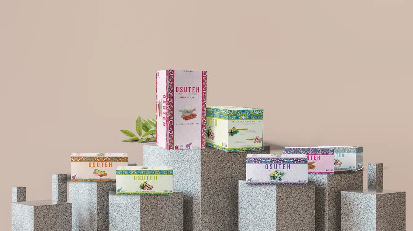
OSUTEH is a Sri Lankan herbal tea range, and this was design work for Starron Group. I made the brand identity, the packaging for the range, a set of stationery and a website design. Two months later I made a product catalogue film to replace a slideshow. Both projects are on my Behance profile.
The brief
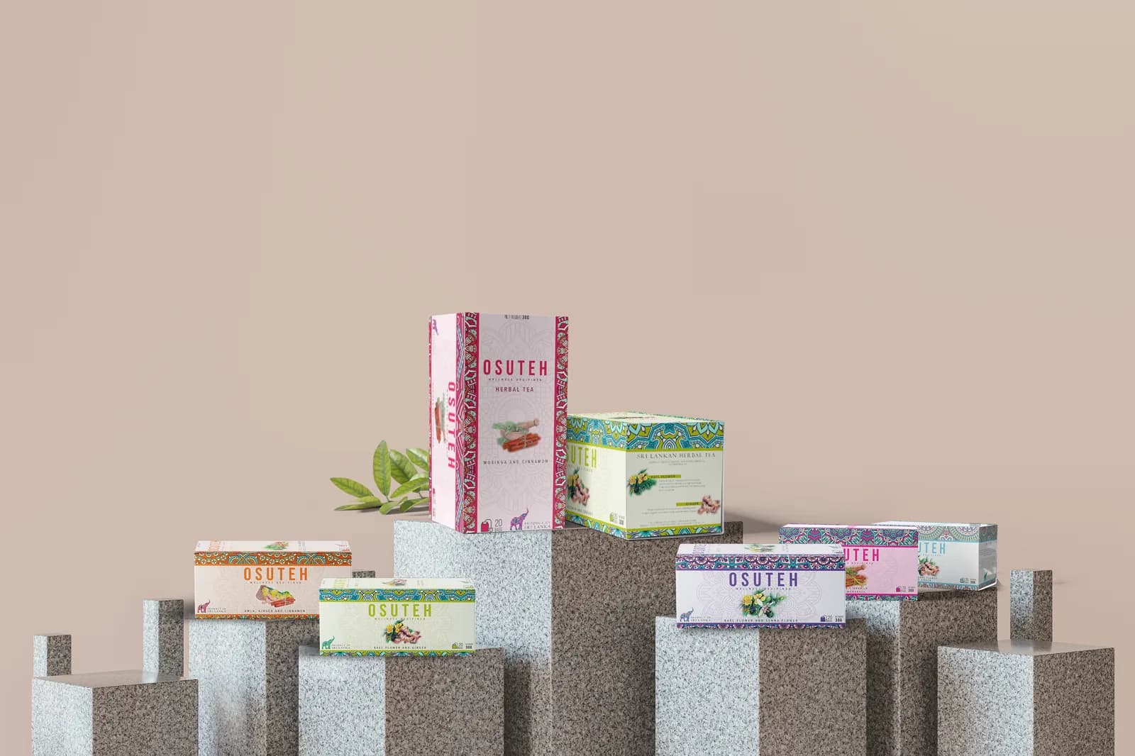
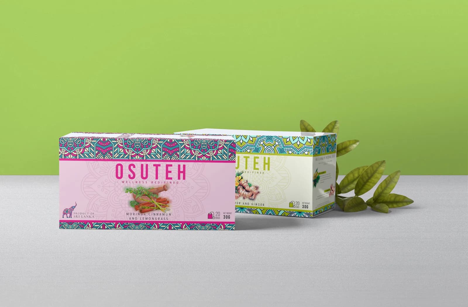
The tea is sold as a range of blends, so the packaging had to do two jobs. Each box needed to read as OSUTEH at a glance, and each blend needed its own identity on the shelf. The line on the pack is "Wellness redefined".
The brand system
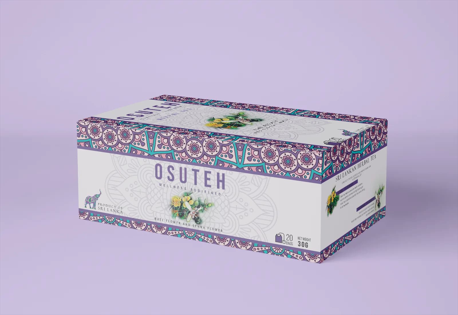
I drew the identity in Illustrator: a spaced, all-caps wordmark, an elephant mark, and a mandala pattern that sits behind the type and runs along the edges of the box. The mandala is the common thread. It is the same on every blend, so the range holds together even when the colours change.
Packaging
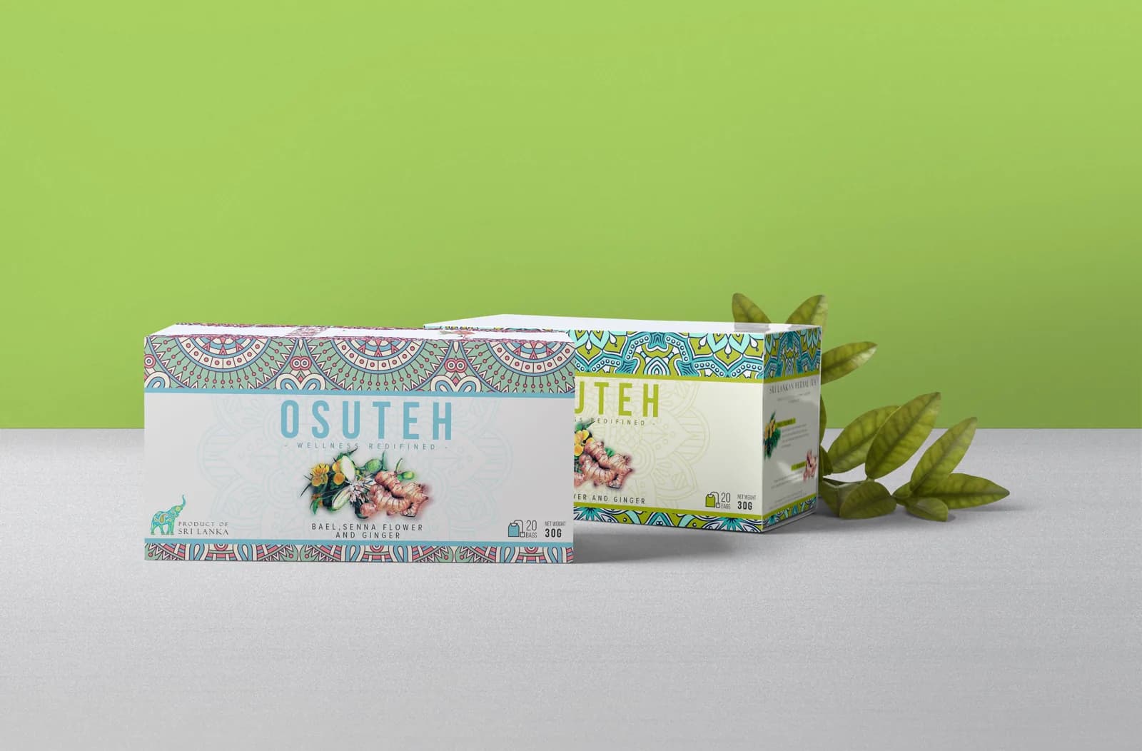
Every blend uses the same layout. The wordmark is centred, ingredient photography sits under it, and the ingredient names run along the bottom. Each box also carries the count, the net weight and "Product of Sri Lanka". Only the border colours and the ingredient image change, so a new blend is a recolour, not a redraw.
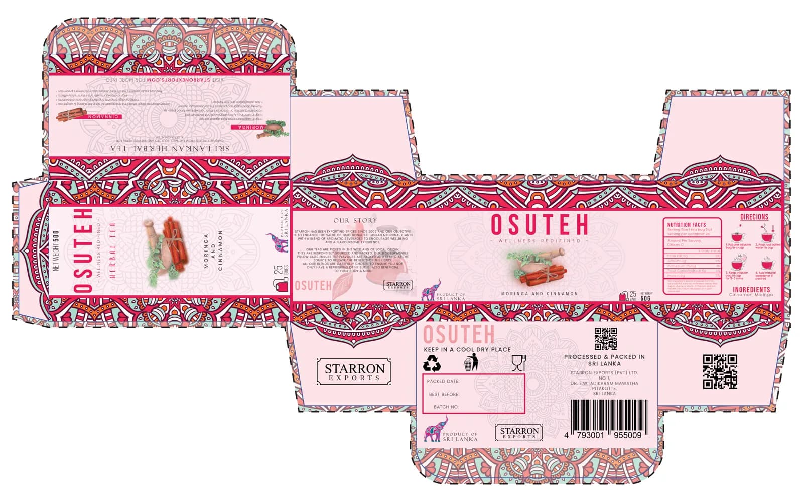
The dieline is the file the printer works from, so I laid it out with the barcode, the QR code and the recycling marks in place.
Stationery and web
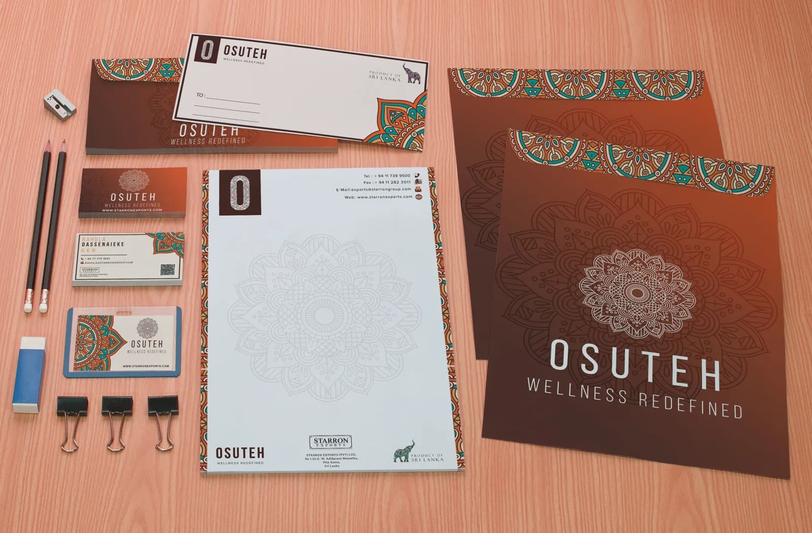
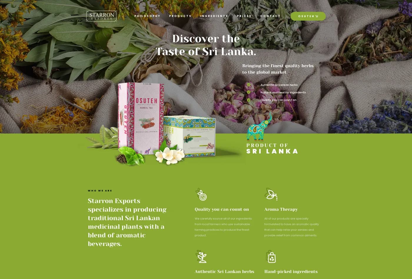
The same mark and pattern carry onto letterheads, business cards, envelopes and folders, and onto a website design for the brand.
The catalogue film
The second project replaces a slideshow with a short film. After an OSUTEH title card, it shows the range together, then gives each of the nine blends its own slide. Each slide sits on a tinted version of the mandala, matched to the box colour, and lists the ingredients with a small photo of each. I built it in After Effects and Premiere Pro, with Illustrator and Canva for artwork.
What I did
- Designed the OSUTEH identity: wordmark, elephant mark and mandala pattern.
- Designed the box and label artwork for the range, plus the dieline.
- Made the stationery set and the website design.
- Made the catalogue film, from layout through to motion.
What I would do differently
- Test the pale label type at shelf distance. Some of the light colourways are soft on the box.
- Set a short pattern and colour guide for the range, so a new blend can be added without me.
- Add captions to the film. Most of the information on screen is ingredient text, and it moves quickly.